Restaurant Signage Guide: How To Make Signs Work Harder
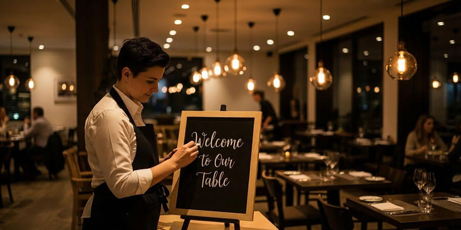
Table of Contents
Improve restaurant signage by focusing on visibility, readability, placement, and message discipline instead of treating signs like decoration
Restaurant signage works best when it does one job clearly. It should help the right person notice you, understand what you offer, and take the next step without confusion. When signs try to do too much, they stop doing anything well.
That is why the best restaurant signage is usually simpler than owners expect. It is easier to read, easier to spot, and more consistent with the rest of the restaurant experience. This article keeps the advice focused on what actually matters in practice.
Start With The Job Each Sign Is Supposed To Do
Not every sign has the same role. A storefront sign, an A-frame, a window sign, and an interior menu display should not all be treated as if they are solving the same problem.
| Sign Type: | Main Job: | Common Mistake: |
| Exterior storefront sign | Help people identify the business quickly | Overloading the sign with too much text |
| Sidewalk or A-frame sign | Catch nearby foot traffic and support one message | Turning it into a mini brochure |
| Window sign | Reinforce offers, hours, or brand cues | Blocking visibility into the space |
| Interior menu or directional signage | Help customers decide or move smoothly | Mixing too many messages in one area |
Once you define the job, the design choices get easier.
Visibility Beats Cleverness
The smartest sign in the world fails if no one sees it. Restaurant owners often spend too much time on clever wording and not enough time on line of sight, height, lighting, contrast, and obstruction.
Ask practical questions:
- can drivers or pedestrians see the sign early enough to react
- is anything blocking it from common approach angles
- does it stay visible at night or in poor weather
- does the surrounding streetscape make the sign blend in too much
If the sign is hard to see, the copy quality does not matter much.
For operators working on the broader local-discovery picture, Restaurant Marketing Guide is the best broader companion resource.
Readability Matters More Than Extra Information
Good restaurant signage should be processed fast. Most people do not stand still long enough to decode a crowded sign with weak contrast and too many ideas competing for attention.
That means readability usually improves when you:
- keep the message short
- use strong contrast
- avoid crowding too many type styles together
- make the most important words the easiest to see
- leave enough empty space so the message can breathe
The best sign often feels almost too simple when you are designing it. That is usually a good sign.
Match The Message To The Distance
One of the most common signage mistakes is using the same message style everywhere.
| Viewing Situation: | What Works Best: |
| Seen from the street or parking area | Business name, main category cue, bold simple message |
| Seen while walking past | One offer, one prompt, or one directional cue |
| Seen at the order point | Clear menu, pricing logic on the actual menu system, or pickup instructions |
| Seen inside the dining room | Reinforcement, not clutter |
The farther away the viewer is, the simpler the sign should become.
Keep Exterior Signs Consistent With The Experience Inside
Restaurant signage is not isolated branding. It sets an expectation before the guest even steps in.
If the exterior sign communicates one style and the menu boards, host stand, or pickup area communicate something completely different, the whole experience feels less intentional. Strong signage works when the voice, look, and tone stay coherent from outside to inside.
This matters even more when the restaurant uses several sign types at once, such as outdoor directional signs, window messaging, counter signage, and menu displays.
For the product side of that setup, Menu Boards & Covers and Advertising Signs & Boards are the most natural supporting categories.
Use Signage To Reduce Friction, Not Just To Promote
The best restaurant signs do not only advertise. They reduce confusion.
Useful signage can help customers understand:
- where to enter
- where to line up
- where to pick up orders
- whether seating is self-service or host-managed
- what the featured offer or limited-time message is
This is especially important in restaurants that handle dine-in, takeout, and pickup at the same time. In those setups, signage is partly an operations tool.
If guest flow is part of the challenge, Restaurant Offline Marketing Guide is the best next read.
Update What Changes, And Remove What No Longer Helps
Signs lose value when they stop being accurate.
That applies to:
- outdated promotions
- old hours
- seasonal offers that are still posted
- faded or damaged sidewalk signs
- interior signs that reference a process you no longer use
A stale sign does more than look bad. It teaches customers not to trust the information on your signs.
That is why signage maintenance is part of signage strategy.
The Best Restaurant Signage Usually Feels Obvious To The Customer
That is the real goal. Guests should not have to work to understand where they are, what you offer, or what to do next. They should feel guided without noticing the effort behind it.
That usually means fewer messages, stronger placement, clearer type, and more discipline in what each sign is allowed to do.
If you need to support exterior visibility with street-level options, A-frame sign boards are often one of the most practical next categories to review.
Frequently Asked Questions
What makes restaurant signage effective?
Effective restaurant signage is visible, readable, and focused on one main job. It helps the customer notice the restaurant, understand the message quickly, and decide what to do next. Signs become less effective when they try to say too much at once or are placed where people cannot easily see them.
What should a restaurant sign include?
That depends on the sign type. A storefront sign usually needs the business identity first. A sidewalk sign usually needs one short message or offer. Interior signs should help with decisions, directions, or service flow. The strongest sign includes only the information needed for that exact moment.
Should restaurant signage be updated often?
Yes, whenever the message changes. Outdated signs damage trust quickly, especially if they show old hours, expired offers, or pickup instructions that no longer match the operation. Signs should be reviewed often enough that they stay accurate and useful.
Are A-frame signs still useful for restaurants?
Yes, when they are allowed locally and placed well. They work best for nearby foot traffic and are most effective when they carry one short, relevant message instead of a crowded list of details.
Why does restaurant signage matter beyond branding?
Because signs also reduce friction. They help customers find the entrance, understand pickup flow, recognize specials, and move through the space more confidently. Good signage supports operations as much as marketing.
What is the biggest signage mistake restaurants make?
Overloading the sign. Too much text, too many visual ideas, and weak contrast make the message harder to process. Most restaurant signs improve when the message gets shorter and the hierarchy gets clearer.
Related Resources
- Restaurant Marketing Guide - Broader marketing strategy beyond in-store and exterior signage.
- Restaurant Offline Marketing Guide - Physical-world promotion and visibility tactics for restaurants.
- Advertising Signs & Boards - Category page for exterior and promotional sign options.
- Menu Boards & Covers - Menu presentation options that support signage consistency.
- A-Frame Sign Boards - Sidewalk display options for walk-by visibility.
Share This!